

High Quality Inkjet Printer Inks: The Complete Guide to Vivid, Long-Lasting Prints
2026-08-01
Every print tells a story—don’t let faded colors and smudged lines ruin yours. Whether you’re printing cherished family photos or sharp professional graphics, the difference between a forgettable page and a masterpiece often comes down to one thing: your ink. But not all inks are created equal. In this complete guide, we’ll explore what truly makes inkjet inks high quality, from pigment purity to fade resistance, and share tips to achieve vivid, long-lasting prints. And when you’re ready to experience the next level of color brilliance, Danmajet delivers precision-engineered inks that bring every detail to life. Let’s dive in and revolutionise the way you print.
Why Ink Quality Matters More Than You Think
The ink you choose does far more than simply transfer color onto a page. It shapes the way your audience perceives your message before they even read a single word. Low-quality ink can fade unevenly, bleed through paper, or shift tones over time, eroding trust and making even the best design feel amateurish. This hidden factor influences everything from brand recall to the perceived value of printed materials, yet it's often treated as an afterthought.
Consider the physical sensation of a premium magazine or a luxury business card. The richness of the blacks, the crisp edges of lettering, and the way the ink sits on the surface all contribute to a tactile and visual experience that screams quality. Inferior ink fails to deliver this, leaving a muddy, inconsistent finish that can undermine hours of careful design work. It's not just about aesthetics—durability plays a key role too. High-quality inks resist smudging, water damage, and UV fading, ensuring your message remains intact and vibrant long after it's printed.
Beyond appearance, ink chemistry impacts the environment and your health. Many low-cost inks contain heavy metals or volatile organic compounds that off-gas over time, affecting indoor air quality. Choosing a reputable ink supplier with transparent sourcing practices not only elevates your final product but aligns with sustainability goals that resonate with conscious consumers. In a world where every touchpoint matters, the humble ink cartridge holds more power than most realize.
Breaking Down Ink Formulations: Dye vs. Pigment
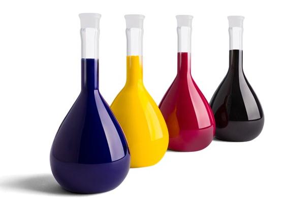
The core distinction between dye and pigment inks lies in how they deliver color to the paper. Dyes are like sugar in water—they dissolve completely at a molecular level, creating a vibrant, translucent liquid that soaks deep into the fibers. Pigments, on the other hand, act more like fine sand suspended in a liquid; they consist of solid, microscopic particles that sit on the surface of the paper rather than penetrating it. This fundamental difference affects not just the visual result but also longevity, water resistance, and how the ink interacts with various media. Understanding this helps in choosing the right ink for your specific project, whether it’s a glossy photo or a document that needs to last decades.
A real-world analogy can make this clearer: imagine spilling a glass of red wine versus dropping some paprika powder on a white tablecloth. The wine, like a dye, stains deeply and permanently into the fabric, but the color might fade over time with washing or sun exposure. The paprika, similar to a pigment, sits mainly on the surface; you can brush most of it off, but what remains can be stubborn and holds its color well against light. In printing, that translates to a trade-off: dye inks often deliver richer, more brilliant colors right out of the printer, but they’re more vulnerable to UV light and moisture. Pigment inks might look slightly more muted initially, but they resist fading and water damage far better, making them the standard for archival and outdoor applications.
Beyond the chemistry, the choice between dye and pigment also shapes the entire printing workflow. Dye inks tend to be more forgiving on a wider range of papers, flowing smoothly through printer heads and drying quickly. This makes them popular for everyday printing and vibrant photo labs. Pigment inks demand specially coated media to achieve their full potential, but once paired correctly, they yield exceptional detail and durability—think fine art prints or museum-quality reproductions. Ultimately, neither is universally superior; it’s about matching the ink’s character to your intent. If you’re after pop and immediacy, go dye; if you need resilience and tonality, pigment is your ally.
The Hidden Cost of Cheap Inks
It’s tempting to grab that bargain-priced ink cartridge, especially when the name-brand option seems unreasonably expensive. But that upfront saving often unravels the moment you print. Cheap inks can clog print heads, leading to streaky pages, wasted paper, and endless cleaning cycles that drain both your patience and your actual ink supply. Suddenly, what looked like a deal becomes a recurring expense in time, frustration, and ruined prints.
Beyond the immediate annoyances, low-quality inks tend to fade faster when exposed to light or humidity. That means important documents, cherished photos, or professionally printed materials may lose their clarity and vibrancy far sooner than expected. The hidden cost isn’t just monetary—it’s the archival value you sacrifice when you opt for subpar formulations that cut corners on pigment stability and UV resistance.
There’s also a less obvious toll on your hardware. Printer manufacturers design their machines around specific ink chemistries, and using off-brand or cheap alternatives can cause buildup that shortens the life of critical components. Repairs or premature printer replacement easily outstrip any initial savings, transforming a small frugality into a major budget hit. What starts as a few dollars saved on ink can quietly snowball into a costly lesson in the economics of printing.
How to Spot Inks That Truly Resist Fading
Real fade resistance starts before the ink ever touches paper. Many inks claim archival quality, but without understanding their composition, you're gambling. Look for pigments over dyes. Dyes dissolve completely and are notoriously vulnerable to light and moisture, while pigment particles sit on the surface and lock into the fibers. Check the label for lightfastness ratings based on the ASTM or Blue Wool scale—anything below a 6 on the Blue Wool scale is likely to disappoint in a sunny room. Also, a quick solvent test at home can reveal a lot: a swab of isopropyl alcohol on a dry sample often lifts fugitive dyes instantly, but leaves truly resilient pigment lines undisturbed.
Beyond the bottle, the paper plays a silent but critical role. Even the most stable ink will shift color or fade if the substrate is acidic or coated with optical brighteners that degrade over time. Hold a sheet up to natural light; if you see a blue-white glow, those brighteners are already working against longevity. Stone papers or cotton rag with a neutral pH give ink a stable foundation, while standard copy paper accelerates breakdown. When testing, compare how the same ink behaves on different surfaces—fade-resistant inks maintain density and hue with minimal haloing, while lesser ones bleed and pale within weeks.
Finally, trust your eyes over marketing claims. Create a sun test strip: draw a bold line, cut it in half, and tape one piece to a window that gets direct sun. Leave the control piece in a dark drawer. Check them side by side after a month. If the exposed sample hasn't shifted noticeably, you've found a performer. Pay attention not just to fading, but to shifts in tone—a black that turns brown or a blue that goes gray reveals poor stability. Art supply stores often have staff-made swatch books with real aging data; those carry more weight than any printed guarantee.
Matching Ink to Paper for Stunning Results
The bond between ink and paper determines whether your project feels effortlessly professional or slightly off. Each pairing behaves differently—some inks bleed into absorbent sheets, creating a softer edge that suits artistic prints, while others sit sharply on coated surfaces for crisp, high-contrast text. Understanding this relationship lets you control the final impression, from velvety depth to bright clarity.
A common misstep is treating all paper as a blank canvas that accepts ink identically. In reality, uncoated stocks absorb ink deeply, muting vibrancy but lending a tactile, organic feel ideal for letterpress or written correspondence. Glossy or satin finishes, by contrast, keep pigments hovering near the surface, amplifying color punch and detail. Matching the ink’s viscosity and drying time to the paper’s porosity avoids muddy results and speeds up production without sacrificing quality.
Testing small swatches before a full run reveals nuances no catalog can predict. Watch how the ink settles into the grain, whether it feathers along the fibers, or if the sheen aligns with your vision. This hands-on approach turns a technical decision into a creative one, ensuring your final piece delivers the sensation you imagined—whether that’s a whisper of elegance or a bold statement.
Simple Storage Tricks to Extend Ink Life
To get the most out of your ink cartridges, proper storage is key. Keep them in a cool, dark place, ideally between 60 and 75 degrees Fahrenheit, and away from direct sunlight or heat sources, which can cause the ink to dry out or degrade. If you have unopened cartridges, store them upright in their original packaging to protect the print head from damage and maintain proper pressure balance.
Humidity also plays a big role—aim for a moderate level, around 40 to 60 percent, to prevent the ink from thickening or evaporating too quickly. For opened cartridges, a simple trick is to seal them in a plastic zip-top bag with a slightly damp paper towel; this creates a micro-humidity chamber that keeps the ink from drying out. Just make sure the towel doesn’t touch the cartridge directly, or it could clog the nozzles.
Rotating your stock might seem old-fashioned, but it works wonders. Always use the oldest cartridge first to avoid expiration issues, and remember that even sealed cartridges have a shelf life—typically around two years. Give each cartridge a gentle shake before installing to re-suspend any settled pigment, and you’ll often find your prints looking sharper while the cartridge lasts noticeably longer.
FAQ
It comes down to how the ink is formulated. The best ones use pure, finely ground pigments that resist fading and deliver consistent colour. You’ll notice richer blacks, smoother gradients, and prints that stay vibrant for decades under proper conditions.
Longevity depends on using pigment-based inks paired with archival-quality paper. Keep finished prints away from direct sunlight, high humidity, and airborne pollutants. A well-chosen ink and paper combination can easily last a lifetime when stored or displayed sensibly.
Dye inks soak into the paper, giving incredibly bright and punchy colours right out of the printer, but they’re more prone to fading over time. Pigment inks sit on the surface and are much tougher — water-resistant, UV-stable, and ideal for prints you want to keep. The trade-off is that pigment colours can sometimes feel a touch more subdued on certain papers.
Stick to inks that match your printer’s head technology. Check what the manufacturer recommends, but don’t be afraid of reputable third-party alternatives that explicitly state compatibility. Avoid anything that feels suspiciously cheap, as poor formulation can clog nozzles and ruin print heads.
Often it’s not the printer but the paper and ink combination. A high-quality ink needs a coated paper designed to receive it — preferably one with an inkjet-specific layer. Also, your colour management settings matter: using the right ICC profiles for your ink-paper pair makes a noticeable difference in vividness.
Keep them sealed in their original packaging, standing upright, and in a cool, dark place. Extreme temperatures cause the ink to separate or dry out. If you’ve already opened a cartridge, consider using it within six months for best results, and always store it with the nozzle facing upward if it’s been installed briefly.
Quality varies a lot. Some third-party manufacturers invest in advanced formulations that match or even exceed original inks, and they’re perfectly safe. Others cut corners and use inconsistent particle sizes that can clog print heads. The key is to research and stick to well-reviewed brands — reading feedback from other users of your exact printer model is a smart move.
It used to be, but modern pigment inks manage to deliver both. They encapsulate colour particles in a durable shell that resists water without dulling the colour too much. With the right paper, you can get prints that pop with colour and don’t run if they get splashed — it’s a game-changer for outdoor signage, kitchen calendars, and anything that faces the elements.
Conclusion
The difference between a print that captivates and one that disappoints often comes down to a factor many overlook: the ink inside the cartridge. High-quality inks don't just deliver brighter colors; they fundamentally alter how long an image stays true before fading and how reliably your printer performs over time. At the heart of the matter are the two main formulations: dye-based inks, which soak into paper for stunning, saturated hues, and pigment-based inks, which lay microscopic particles on the surface for superior water resistance and archival longevity. Skimping here, however, carries a concealed price. Bargain inks may seem economical upfront, but they often clog printheads, consume more fluid per page, and force costly repairs—not to mention the frustration of prints that rapidly turn dull or orange-shifted.
Truly fade-resistant prints start with scrutinizing lightfastness ratings and choosing inks engineered to withstand UV rays and environmental ozone. But ink alone isn’t the whole story: pairing it with the right paper is where the magic happens. A premium pigment ink on a matte fine-art sheet renders deep, textured blacks, while the same ink on a glossy photo paper can create crisp, vibrant gloss without pooling. Finally, even the best ink can be sabotaged by poor storage. Keep cartridges upright in a cool, dark place, and if you’ve opened them, seal them with a clip to prevent the nozzles from drying. These quiet, simple habits dramatically extend the life of your supplies, ensuring every print matches the moment you intended to capture.
Contact Us
Contact Person: Jacky
Email: [email protected]
Tel/WhatsApp: 086 15000607053
Website: https://www.danmajet.com