

Custom Tact Switch Manufacturer Insights for Superior Tactile Feedback
2026-11-16
Ever pressed a button and felt that perfect click—crisp, satisfying, and utterly reliable? That’s the magic of a well-designed tactile switch. But not all tactile switches are created equal. If you’re searching for superior tactile feedback, the secret often lies in partnering with a custom tact switch manufacturer who truly understands the nuances of force curves, travel distance, and actuation consistency. KEJIAN ELECTRONICS has been quietly perfecting this craft, turning subtle engineering choices into unforgettable user experiences. In this post, we’ll pull back the curtain on what separates ordinary switches from exceptional ones—and why customization might be the missing ingredient in your next design.
How Custom Tact Switches Shape the Feel of a Product
The click of a button might seem like a minor detail, but for anyone who has pressed a mushy keypad and then a crisp, snap-action switch, the difference is immediate. Custom tact switches let product teams tune the actuation force, travel distance, and even the acoustic profile of that press. Instead of settling for an off-the-shelf component that feels generic, designers can specify a shorter throw for a gaming peripheral or a softer, quieter dome for a medical device. That adjustment changes how confident the user feels with every input.
Beyond the raw specs, the material and internal structure of the switch introduce subtle tactile feedback that users internalize without naming it. A stainless steel snap dome, for instance, delivers a sharper break than a rubber dome, while a gold-plated contact can make the release feel slightly cleaner. These choices accumulate into the perceived quality of the product. A well-chosen custom switch makes a control panel feel deliberate, almost machined, while a poorly matched one leaves the whole interface feeling hollow.
The real value shows up in products that live or die by repeated use. A handheld scanner clicked hundreds of times per shift, a synthesizer played through a set, or a dashboard button pressed in cold weather—each one benefits from a switch tuned to the user's rhythm and environment. Customization isn't about adding features; it's about removing the small frictions that make a product feel cheap or exhausting. When the switch matches the user's expectation, the press itself becomes part of the product's character.
Why Material Choice Changes Tactile Response More Than You Expect
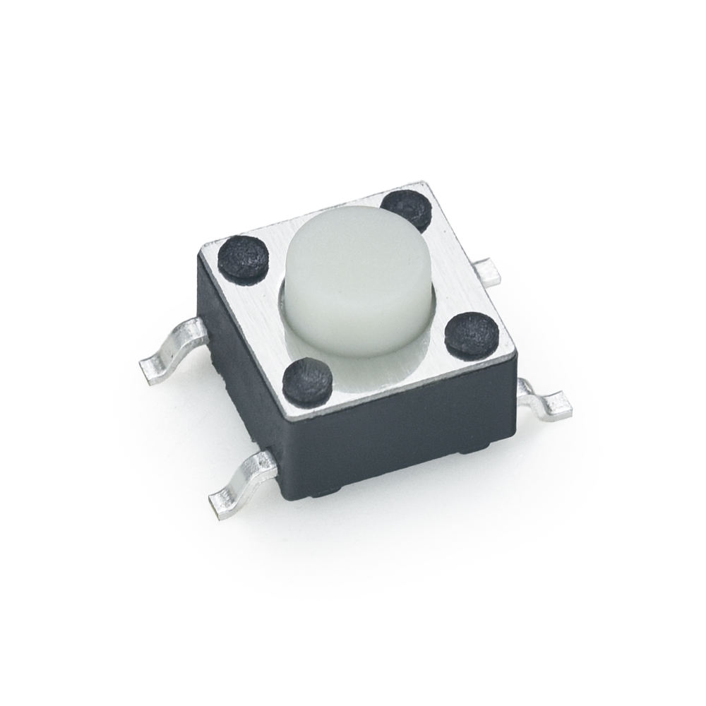
Most people assume a button feels different only because of its shape or travel distance, but the material underneath your fingertip plays a far more dramatic role. A glossy polycarbonate keycap can feel slippery and almost cold, while the exact same geometry in a soft-touch elastomer seems to grip your skin and warm up within seconds. That shift isn't just psychological—it stems from how surface roughness, thermal conductivity, and micro-deformation interact with the ridges of your fingerprint. You can measure identical force curves on a testing rig, yet your hand will swear they're two completely different components.
Take anodized aluminum versus injection-molded ABS. The metal pulls heat away from your finger rapidly, creating a sensation of hardness and precision that has nothing to do with actual stiffness. The plastic, by contrast, reaches skin temperature almost instantly and yields microscopically under pressure, which your nerves read as softness or even a slight stickiness. Change only the coating—from matte to glossy—and you'll notice the perceived clickiness of a switch shifts even though the mechanical snap is untouched. This happens because your sense of touch integrates texture, temperature, and tiny vibrations into a single unified impression, not separate data points.
Designers who ignore this often end up with products that feel cheap or unintuitive despite having excellent technical specs. A keyboard with perfect actuation force can still feel mushy if the keycap material deadens high-frequency vibrations that your fingertips use to detect crispness. On the flip side, a simple remote control gains a premium feel simply by swapping from painted plastic to a lightly textured thermoplastic elastomer. The lesson is clear: material selection isn't a cosmetic afterthought—it rewrites the entire language your product speaks to the user's hand.
The Hidden Tradeoffs in Actuation Force and Travel Distance
The relationship between actuation force and travel distance rarely behaves like a simple seesaw. In most real systems, increasing one quietly steals from the other through mechanisms that are often buried in specifications. A linear screw actuator, for example, can be geared to produce impressive pushing force, but that same gear reduction shrinks the distance it can cover in a given time. The energy stored in the moving element remains roughly constant, so force and displacement trade places along the same curve.
What makes these tradeoffs hidden is that they shift depending on operating point. A pneumatic cylinder may deliver its rated force only near the end of its stroke, where pressure has built up, while the middle portion delivers far less. Piezoelectric stacks offer enormous force in a package smaller than a thumb, yet their travel is measured in micrometers. Even within a single design, friction, backlash, and compliance can carve away usable force or distance in ways that static datasheets never reveal.
Designers who ignore these interactions often end up with actuators that meet every number on paper but fail in the machine. The practical resolution is not to chase maximum force or maximum travel independently, but to map the entire force-displacement envelope under real load and speed conditions. Sometimes a compound lever or a two-stage mechanism can shift the balance without adding bulk, but it always introduces new losses. The hidden tradeoff is not a flaw to eliminate; it is the physical terrain you must walk through.
What Top Manufacturers Do Differently for Consistent Feedback
Instead of treating feedback as a collection of complaints, leading manufacturers build direct channels between the shop floor and the people who use the product. They map every piece of feedback to a specific production batch, material lot, or process step. This lets them trace a recurring issue back to its source in hours rather than weeks.
Another differentiator is how they classify and prioritize feedback. Rather than relying on star ratings alone, they score each report by potential impact on safety, repeat purchase likelihood, and cost of correction. High-impact signals get routed to engineering and quality teams immediately, while minor notes are aggregated for monthly design reviews. The result is that no useful detail gets lost in a support ticket queue.
Finally, top manufacturers make feedback part of the production rhythm, not an afterthought. Weekly quality stand-ups include direct quotes from operators and end users, and those quotes influence adjustment of tolerances, supplier audits, or training scripts. Over time, this creates a culture where consistent feedback is expected and acted on, which keeps product variation low and trust high.
Designing for the Human Finger, Not the Datasheet
Touch targets built strictly from spec sheets often ignore how a real fingertip moves and presses. The pad of a finger isn't a pixel-perfect cursor; it shifts, rolls, and obscures what's beneath it. So instead of merely honoring minimum sizes, look at the arc of a thumb sweeping across a handheld screen or the slight tremor of an outstretched index finger on a kiosk. Place the most frequent actions where that natural motion already rests, rather than forcing a stretch to hit a tiny icon anchored to a corner because the grid says it fits.
Spacing matters as much as the size of the button itself. Two adjacent controls can each pass a minimum-size check yet still cause misfires because the gap between them is too narrow for a finger to land cleanly. The real test is not the button's bounding box but the negative space you preserve around it. Give the finger room to err, to land slightly off-center, and still trigger the intended action without catching a neighboring control. This invisible padding is what separates a design that feels forgiving from one that demands surgical precision.
Finally, design for the moment of contact, not just the static layout. A finger pressing down changes shape, flattening against the glass and covering a wider area than its resting outline suggests. Feedback should respond to that entire press, not a single coordinate. If a tap needs visual confirmation, let it appear slightly above the finger, not underneath it. And for repeated actions, consider how fatigue alters aim over time; a target that worked in the first minute may fail in the tenth. Human fingers are not datasheet abstractions, and the interface should remember that.
From Prototype to Production: Keeping the Tactile Signature Intact
The tactile signature is the soul of a product. When a prototype leaves the lab, every ridge, texture, and resistance point has been tuned by hand. Mass production threatens to sand those details away. The first hurdle is material variance: a 3D-printed grip might feel perfect, but the injection-molded version can shift by microns and turn "premium" into "plasticky." Engineers often chase dimensional specs while ignoring durometer, surface finish, and even the slight tack of a coating. That's where the signature gets lost.
One way to keep it intact is to treat haptics as a specification, not an afterthought. Capture the prototype's feel with a profilometer and a panel of blindfolded testers. Record durometer, coefficient of friction, and edge radii. Then lock those numbers into the production QC checklist. It sounds obvious, but most factories only check fit and function. When a supplier changes a mold release agent or a paint batch, the texture can drift without anyone noticing until a customer complains. Regular "touch audits" on the line, using the same blindfolded protocol, catch that drift early.
The final trick is to design for tolerances that matter to the hand, not just the eye. Give the tactile surfaces a wider sweet spot by choosing materials that don't harden or soften dramatically with temperature. Work with the molder to map pressure and cooling time against surface gloss, because gloss and friction often move together. And if a change is unavoidable, re-run the blindfolded panel before approving it. That's how a prototype's tactile signature survives the leap into thousands of units.
FAQ
Custom designs let you tune actuation force, travel distance, and click ratio around a specific product feel rather than forcing a generic component into your design. The best manufacturers will map the entire force-displacement curve with you, not just quote a single peak force number.
Dome material, plating thickness, and substrate stiffness all shift feedback as cycles accumulate. Stainless steel domes typically hold their snap longer than phosphor bronze, but the contact plating matters just as much — gold over nickel lasts far longer in high-humidity environments and prevents the mushy feel that comes from oxidation.
A switch is only as good as the surface pressing it. Button height, actuation angle, and even the durometer of an overlay can mask or amplify the snap. Good manufacturers ask about your total assembly, not just the switch footprint.
If your product needs a distinct half-press confirmation before a full actuation, custom dome geometries can create two clear force drops. This is common in camera shutters, industrial pendants, and medical devices where an accidental full press is costly.
Ask for force-displacement data from multiple production batches, not just golden samples. A trustworthy supplier will share SPC charts for peak force, click ratio, and return force, and they will have inline testing that rejects domes drifting outside your tolerance window.
Peak force is usually held within ±15% of nominal, but travel to make and return force often drift more. For a crisp feel, tighten the click ratio tolerance and specify a minimum return force so the key doesn't feel lazy after repeated use.
Yes. Integrated LEDs, sealed domes for IP-rated panels, rigid flex tails, and even dual-dome arrays for redundant contacts are all possible when the manufacturer has in-house tooling and assembly rather than outsourcing every step.
Request their curve library, ask about minimum order quantities for custom domes, and clarify who owns the tooling if you need to move production later. Also ask how they handle design changes after tooling is cut — a good partner leaves room for small dome adjustments without charging for a full new tool.
Conclusion
The feel of a button rarely gets the attention it deserves until a product lands in someone's hand. Custom tact switches quietly define that first impression, shaping whether a press feels crisp, soft, sharp, or mushy. Material choice drives far more of this than most designers expect. A change in dome metal, plating thickness, or contact coating can shift the tactile curve in ways that a spec sheet never captures. Actuation force and travel distance carry hidden tradeoffs too. Lower force may feel effortless but invites accidental presses; longer travel can feel deliberate yet sluggish. Finding the right balance means mapping the entire force-displacement signature, not chasing a single number.
Top manufacturers earn their reputation by controlling that signature at every stage. They test batches for dome consistency, monitor springback behavior, and reject drift that would make one unit feel different from the next. The best teams also design for actual fingers, not idealized test probes. Finger pads compress, angle of press varies, and users rarely hit dead center. Prototypes often match the datasheet perfectly yet fail in real hands because they ignore those human variables. Keeping the tactile signature intact from prototype to production requires careful tooling maintenance, process audits, and a willingness to tune after first article inspection. When that discipline holds, the final product delivers the same crisp, confident feedback that sold the design in the first place.
Contact Us
Contact Person: Anna lin
Email: [email protected]
Tel/WhatsApp: +86 13567768885
Website: https://www.kjele.com/